You don't need to know about dynamic range to make HDR images but it's useful to have some understanding of what it is.
Our eyes have a high dynamic range (HDR) largely because we've got a really cool automatic aperture system which we call our iris. For most people their retina can adapt to absorbing quite high levels of light and allow them to see in relatively low levels of light. We can see very bright things and very dark things simultaneously. This is what we mean by high dynamic range.
Our retina, therefore, can do these things fairly effectively even without our iris getting involved. Our iris, however, gives us an even greater ability to adapt to light and, in combination with a feedback system from our nervous system, it very efficiently auto exposes whatever we are looking at based on the average light level and gives us a huge dynamic range.
The sensor on a decent camera has a dynamic range that is similar to the best human retina but when we come to print an image on paper or display it on an LCD screen the range available to use drops massively.
We can describe this as a ratio of the contrast we can reproduce (or see).
Computers represent numbers using a binary number system. Each (Bi)nary dig(iT) represents a power of 2, the same way each decimal digit in our decimal system represents a power of 10. As we increase the number of bits we can then represent bigger decimal numbers. So with 1 bit we can represent either the number 0 or the number 1. Something is either there or it is not there. This would represent a black and white 'posterized' image (not greyscale).
Black is 0 and white is 1.
If we increase the number of bits used to 2 we can now represent 0, 1, 2, or 3. At this point we start to get into what we would call a greyscale image. If something is not black that means it has some level of brightness.
We can keep expanding this to 3 bits, 4 bits, 5 bits, etc.
 An 8 bit (Greyscale) image
When we get to 8 bits, we can represent black, 254 levels of grey, and white.
Black is 0
Grey runs from 1–254
White is 255
By now you can see that we have enough bits to get a pretty good representation of our image and it can be very close to what our eye sees (without colour). We now have a good dynamic range.
This is no different from us turning the brightness of a light up or down. If we only have a switch then we can either have the light on or the light off. If we have a dimmer we can set it to many different levels. The light has a minimum level of brightness (black), a maximum level of brightness (white), and a bunch of levels – that are dimmer than white and brighter than black – in between.
Our eyes work with red, green, and blue components. If we take this same ‘brightness represented by a number’ approach, and we use 3 numbers, we can now represent 0–255 for red, same for green, and same for blue. So 1–254 still represents how bright the light is, but it's as if we've stuck a coloured filter in front of the light (this is literally how camera sensors and LCD monitors work). For each light (or pixel) there is a red filter, a green filter, and a blue filter.
Computers represent the colours we see on the screen as 8 bits of red, 8 bits of green, and 8 bits of blue. As a group, we call these three 8-bit numbers 24 bits (sound familiar? 24-bit colour monitor, 24-bit colour image).
In total, 24 bits of data give us a colour range of roughly 16 million colours (lots, right?) but it's just 3 separate numbers that can go from 0–255.
A decent camera sensor uses 16-bit numbers instead of 8-bit numbers. Three times 16 bits gives us 48 bits (280 thousand billion colours). You can access this 48-bit image if you set your camera to take RAW photos.
This means it can subtly represent 65,356 (0–65355) brightness levels instead of 256 (0–255) for each of the primary colours.
This is what we mean by dynamic range. 0–255 represents a low dynamic range, 0–65355 represents a high dynamic range.
HDR and LDR
When an 8-bit number is used to store how bright something is, it has to 'squash' the actual brightness level for each pixel in the image. For just one pixel that is very dark it has to choose whether it should be either 0 (black) or 1 (almost black). This squashing happens across the image all the way up to 254 being almost white and 255 being white. Every brightness level in the image has to fit into one of the 256 boxes.
When we use a 16-bit number, where we could only store a 0 or 1 with an 8-bit number, we can now store 0-255. This is therefore much like when we jumped from a 1-bit black and white image to an 8-bit greyscale image. This means that a really subtle change in a shadow goes from being a choice between black or white to being the equivalent of all the shades of grey in between.
This exact decision (how bright should this pixel be) is what happens in your camera or on your computer when it makes a 24-bit jpeg file from the raw data that came from the sensor, or shows the image on the LCD. Our retina/brain sort of does this too.
We take the high dynamic range of the sensor and 'squash' it down to the low dynamic range of the image format or LCD screen. In doing so, we lose the detail in the shadows because lots of those details just end up being black. The same thing happens right across the image. We lose subtle detail. We notice this most in very dark areas and in very bright areas but it occurs at all levels of brightness.
Tone mapping (So how do people get these images with awesome detail?)
This process of taking the raw sensor data from 16-bit down to 8-bit is known as quantisation. Our cameras do this in a fairly linear fashion. They can't analyse the image and decide which bits of the raw data should be thrown away in an intelligent manner. They pretty much just go 'is the data in the 16-bit sensor between 0 and 255? okay, then in the 8-bit image, make it a 0.'
Pixel 1 might contain a red value of, say, 0. This becomes a 0
Pixel 2 might contain a red value of, say, 64. This becomes a 0.
Pixel 3 might contain a red value of, say, 128. This becomes a 0.
Pixel 4 might contain a red value of, say, 192. This becomes a 0.
Pixel 5 might contain a red value of, say, 256. This becomes a 1.
Pixel 6 might contain a red value of, say, 320. This becomes a 1.
Pixel 7 might contain a red value of, say, 384. This becomes a 1.
Pixel 8 might contain a red value of, say, 458. This becomes a 1.
Pixel 9 might contain a red value of, say, 512. This becomes a 2.
You can keep going with this and you end up with a scale something like this for our 16-bit to 8-bit conversion.
0 = 0
1–255 = 0
256–511 = 1
512–767 = 2
768–1023 = 3
1024–1279 = 4
1280–1535 = 5
1536–1791 = 6
1792–2047 = 7
...
65098–65354 = 254
65355 = 255
We don't have to use this linear method though: we can put more detail in the really dark shadows instead.
0–63 = 0
64–127 = 1
128–191 = 2
192–255 = 3
256–511 = 4
512–767 = 5
768–1023 = 6
We then compensate for this by losing detail in something our eye won't pick up on as much, such as the mid tones. In our scale this becomes.
1024–2047 = 7
Our brain rejects a lot of information, from what we see, as not being important. We can make use of these holes in our vision.
Described above is essentially what using curves, or levels, to move the tonal range around in an image processing program does. We steal details from one area (that doesn't have much detail from our vision's point of view) and we give it back to areas that would benefit from that detail.
This is not quite what we would call tone mapping but is part of what allows us to recover details and make the image look more like what our eye would see.
Tone mapping introduces a level of analysis of the image into this quantisation process. Different tone-mapping tools use different methods to analyse the image. That's way too complicated to go into here and is a highly specialised subject.
The essence of it, though, is that a tone-mapping process looks for areas that have a lot of smaller changes in a set of numbers that are close to each other, much like our pixels 1–7 above. For this range of numbers, it then decides to bias the quantisation process to retain the detail. It compensates for this by looking for areas that have even smaller changes and steals range from there by making the range mapping worse in the area where it is less important.
You can take this mapping process to the extreme and create something beyond what our eyes see. You can even create things that are complete fantasy by making lighter areas glow.
The above isn't completely the truth (cameras can do many things to try and get a good image from the RAW sensor data) but it's a fairly good simplification.
Exposure Bracketing (Or, how we increase our working dynamic range)
We can get even more detail out of a picture by using a technique known as exposure bracketing and combining it with tone mapping.
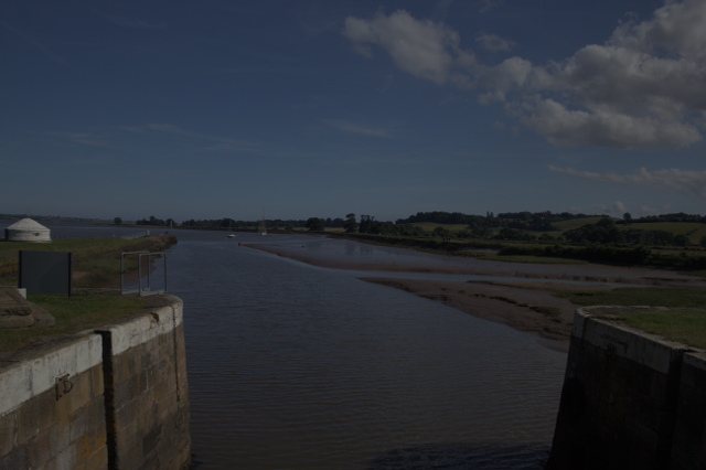
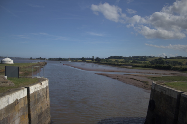
Any photographer will know the problem of trying to get the correct exposure to get the sky to look right and also get the shaded areas under a tree not to be completely black. For a single photo we try to get an exposure somewhere in the middle, or we go for getting a decent exposure of either the sky or the shaded areas.
Exposure bracketing is when you take more than one photo of the same thing with different exposures.
With DSLRs you can tell the camera to take three, or in some cases five or more, photos of the same thing. You can also do this manually of course, but that requires a really steady tripod and/or remote control of the camera to change settings.
In your camera settings, there will be an option to set the automatic exposure bracketing. This usually looks much like the exposure light meter you'll see in the view finder. There's a centre point (mid-exposure) and a scale showing the f-stops of over- or underexposure.
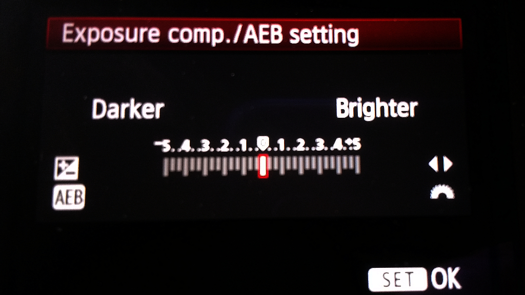
Exposure compensation / Automatic Exposure Bracketing settings
The exposure bracketing settings will let you set multiple marks on this (look in your camera manual or find a tutorial for your camera online). One mark will be the normal exposure, another will be the underexposure level, and a third will be the overexposure level. Your camera may have more than three.
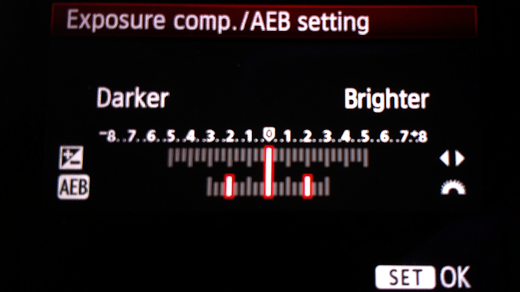
Automatic Exposure Bracketing set to 2 stops overexposure and 2 stops underexposure
So why would we do this?
Exposure bracketing lets us take three 48-bit images, one that has the mid-tone details, one that has the highlights, and one that has the shadows. We get all the detail in the sky and the detail in the bits shaded by the trees plus our mid-exposure photo. So before, where we had 48 bits of detail in our image, we now have up to 144 bits of detail. If we were to work out the number of colours it is astronomical (24-bit gave us 16 million colours, 48-bit gave us 280 thousand billion colours).
The reality is our exposures will overlap (we actually want them to) so we won't quite be getting the equivalent of 144 bits, but even with the overlap, the number of colours we now have to play with is well off the scale.
When we then apply our tone-mapping process onto this astronomical level of detail, it has a lot more information to work with when making its decisions.
There are some things to be aware of. One thing we need to be careful of is the camera or subject moving as we take the shots. Because the shots are taken by the camera one after the other, we need a relatively static scene to work with when using exposure bracketing. That's why you don't see many HDR/strongly tone-mapped photos of racing cars or people moving around. If something in the scene moves too quickly, it will become heavily ghosted. HDR software tends to have tools to try and deal with this, but it's never perfect and your best results will come from making sure nothing is moving during or between shots, camera, or subject.
A good way to stop the camera from moving between shots is to use a reasonably sturdy tripod, this doesn't have to be expensive. My small tripod cost me £7 and fits easily in my rucksack. Many times though I don't use my tripod and instead find an appropriate surface on which to place the camera. I also variously use my camera strap, the tripod quick release bracket mount (normally attached to the camera I place it under the lens or body), pile up some sand or dirt, or find some small stones to raise or lower the view of the camera.
You'll want to experiment with trying different bracketing. I typically go with somewhere between one stop or two stops and I typically drop the centre exposure point by 1/3 of a stop. I usually check the lightest image (for any blown out shadows) and the darkest image (for any blown out highlights). If there are problems in either end I adjust the bracketing or exposure offset and try again.
Exposure bracketing will only work correctly in full manual mode with a fixed ISO speed. If you use aperture priority, shutter priority, or any of the program modes that allow auto adjustment of ISO, shutter speed, or aperture then your exposures will not come out as intended and may not be usable. This is not a problem if you always use your camera in full manual mode but if you're like me you may often switch to shutter priority or semi auto ISO, so it's crucial to get into the habit of checking your camera settings.
Using Luminance HDR to combine LDR or RAW images to make an HDR
(So how do I do this?)
I'm going to use open-source free software for this tutorial. All tools used are available for Windows, Linux, and Mac, at a minimum.
Download Luminance HDR and install it. It can currently be found here:
http://qtpfsgui.sourceforge.net/?page_id=10
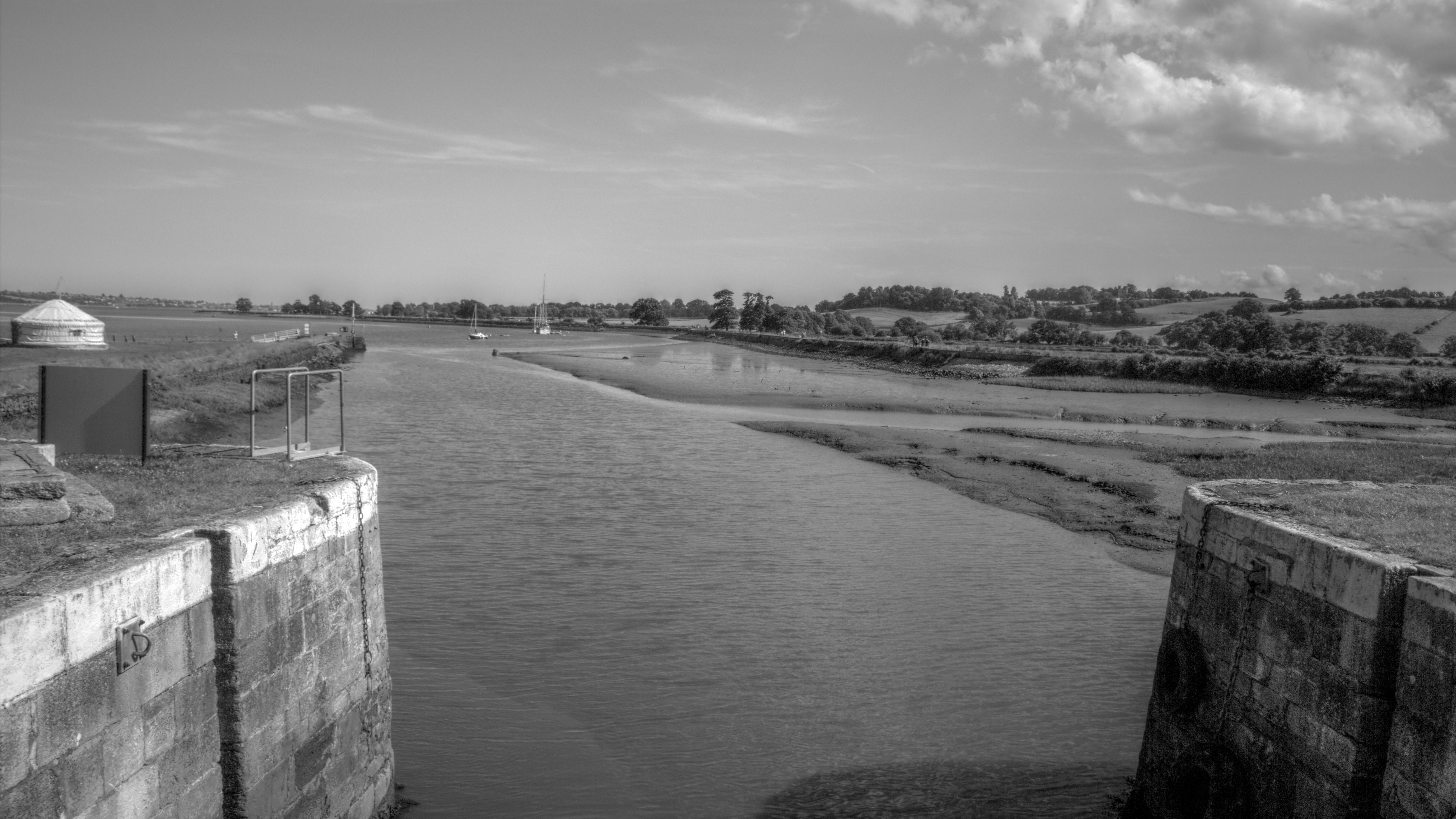
Once you have installed Luminance, you'll need some bracketed RAW images. If you haven't taken any yet, not to worry – I've linked the ones I've used in this tutorial here so you can follow along.
Links to RAW images.
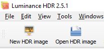
In Luminance choose to create a New HDR Image.
This will open the HDR Creation Wizard
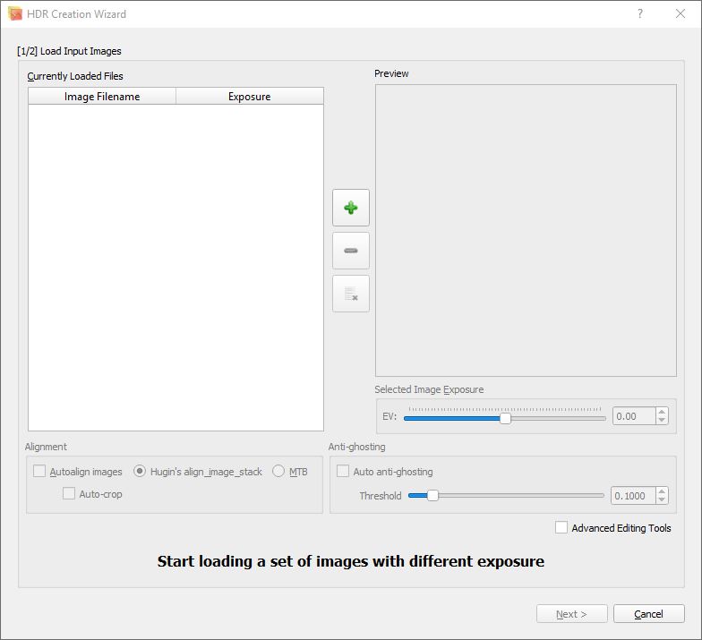
Click the big green  button and select all three images.
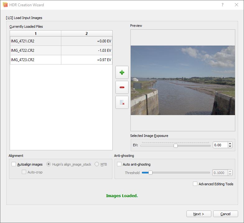
If Luminance is behaving well with your raw images, then it will set the relative exposures. If it doesn't for some reason, then you can try setting them manually. Assuming that the images were bracketed with a single stop centred on a midpoint exposure, the lighter image will be +1, the normal exposure 0, and the dark image -1.
There are options to remove ghosting (due to subjects moving between shots) and auto alignment (due to the camera moving). While these do work, to some extent, they add a lot of time to the processing, use a lot of memory, and rarely produce good results from bad images.
Once the images are loaded and the exposures set, click the [Next >] button.
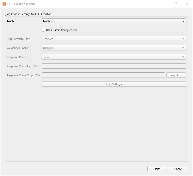
At this point I have no idea what the difference between the various profiles is. We'll just go with Profile 1. Click the [Finish] button.
Woohoo! we have an HDR image. WTF? that looks crap!!!1111
Yep, that's because we haven't told it how we want it to tonemap an LDR preview. As we said above, our monitor is a low-dynamic-range device. We can't actually see HDR images on it.
Save the HDR image. If anything goes wrong, we can just load it up instead of having to go through the creation process again.
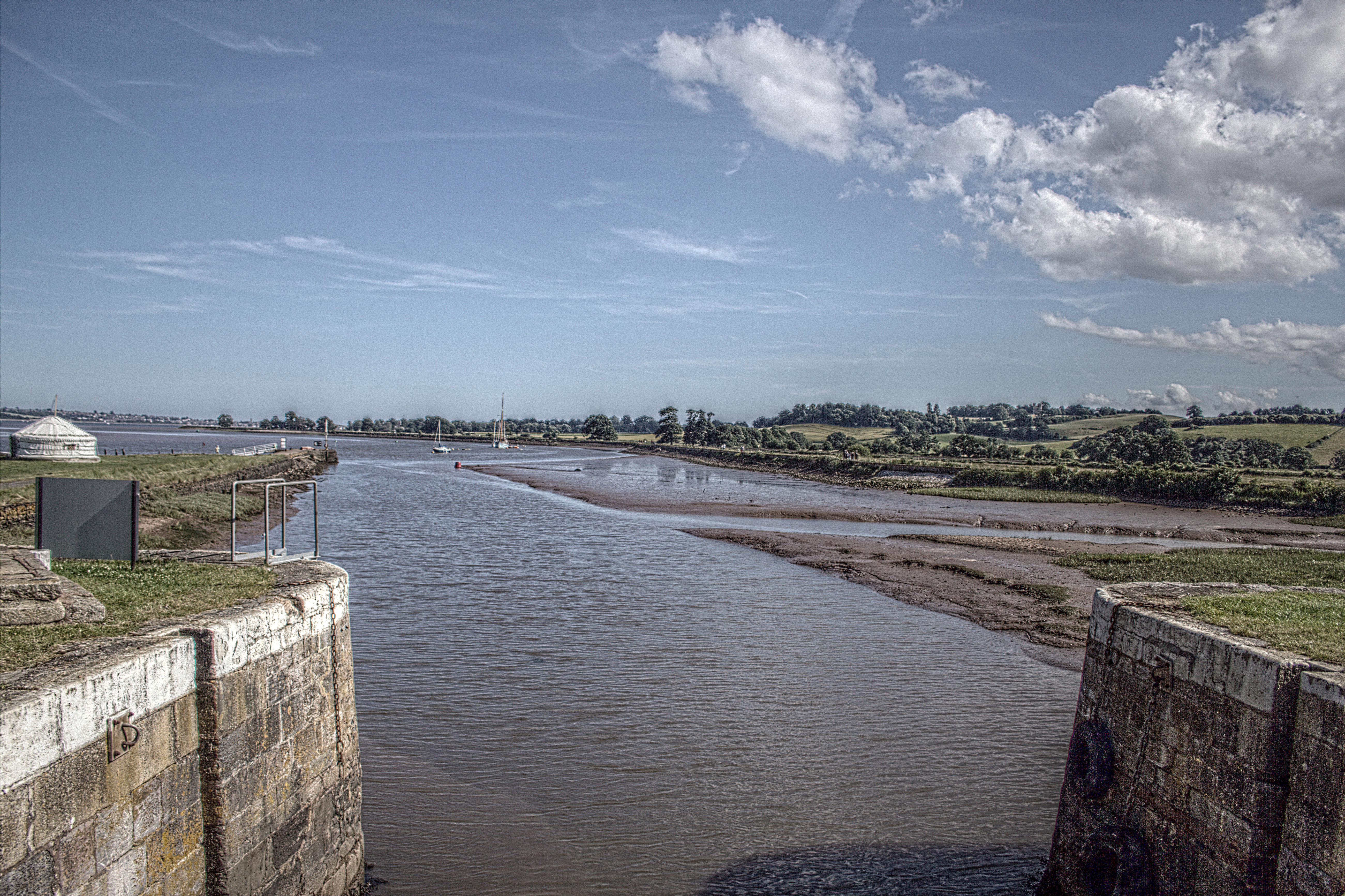
I called my image ’TurfLocksEstuary.exr‘. EXR is a high-dynamic-range file format. EXR can be used in a number of other programs that render HDR images to LDR. By saving the HDR image now it also means our LDR gets appropriately named later.
Rendering a LDR image from a HDR image
(Or, well that's no bloody use to me, what now?)
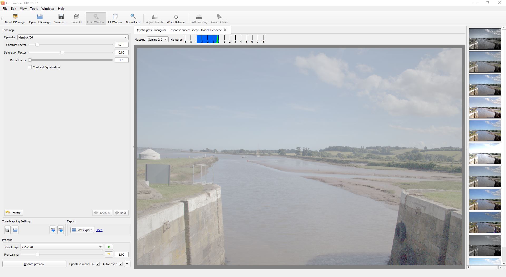
This is where we start to tweak the tone mapping and get something cool.
We're going to use the default Mantiuk '06 tone-mapping operator. It's the one I use most often, it’s easy to use, and it gives pretty good and reasonably intuitive results. Feel free to explore the other tone-mapping operators or look for tutorials on specifically using them. They all work in different ways for different results.
To render the LDR image, I typically start by setting the preview resolution.
You'll find the preview resolution on the left-hand side near the bottom, labelled ’Result Size‘. Set this to something better than 256×170. I usually go for something around 1024×682, though since having 1080p monitors, I've typically nudged that up to 1536×1023. The resolutions listed will be based on the aspect ratio of your source images.
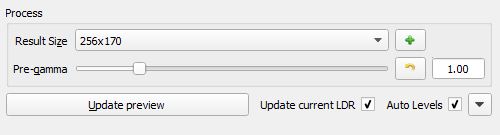
Why not just whack it up to 5202×3465? The larger the preview resolution the longer it will take to tweak results.
Click the [Update preview] button at the bottom left.
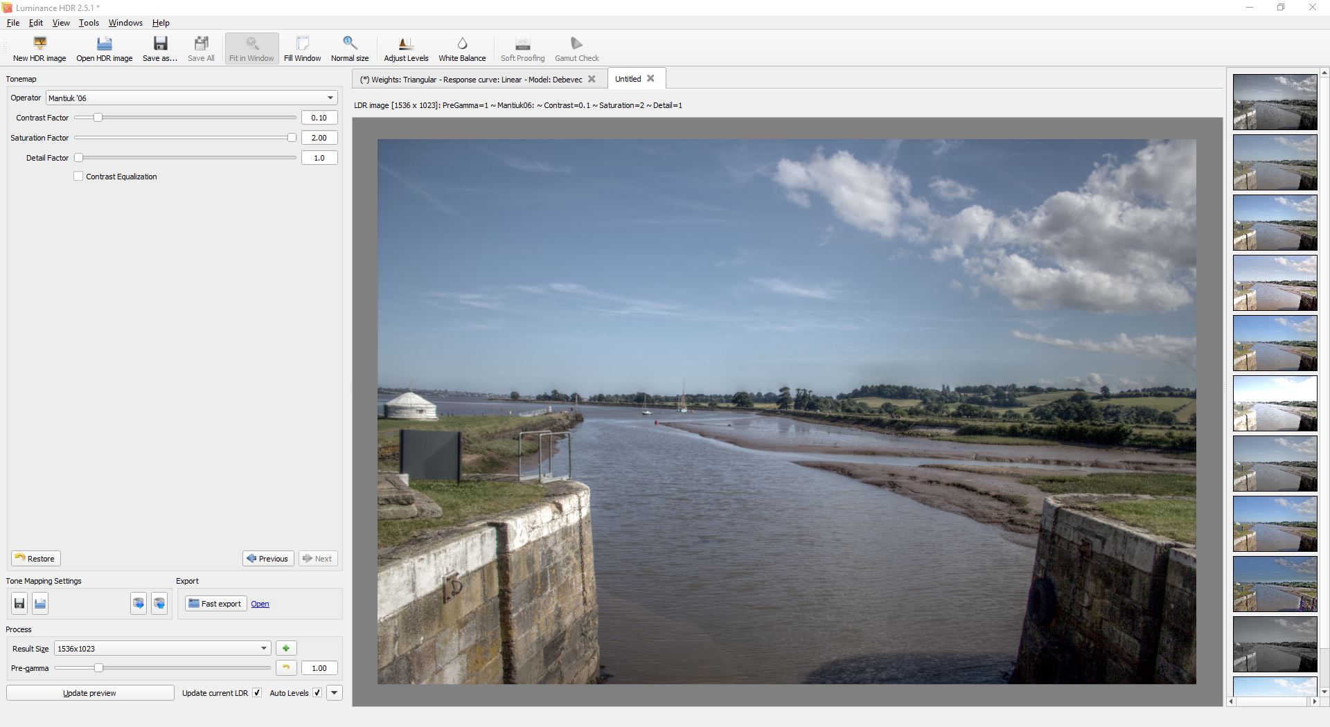
A new tab has just opened and our preview is now shown in it. You can click back and forth between the preview and the unmapped HDR image to see the difference.
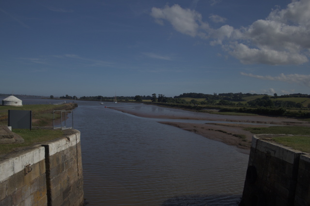
That's better. It looks a lot more like a photo now. You'll notice the colours are washed out. But what you should also notice is that details that aren't in the normal exposure image are clearer in this one. In the preview image we can now see the brickwork on the right more clearly and the tyres. We've also gained a little detail in the sky.
This is where it starts to get fun. For my example, find the 'Saturation factor' setting near the top left and whack it all the way up to 2.0. Click the [Update preview] button again.
You should now see that our colour has been restored. If we want more saturation, we can do that in post-processing in Gimp or we can reduce the Pre-gamma setting in the Process section.
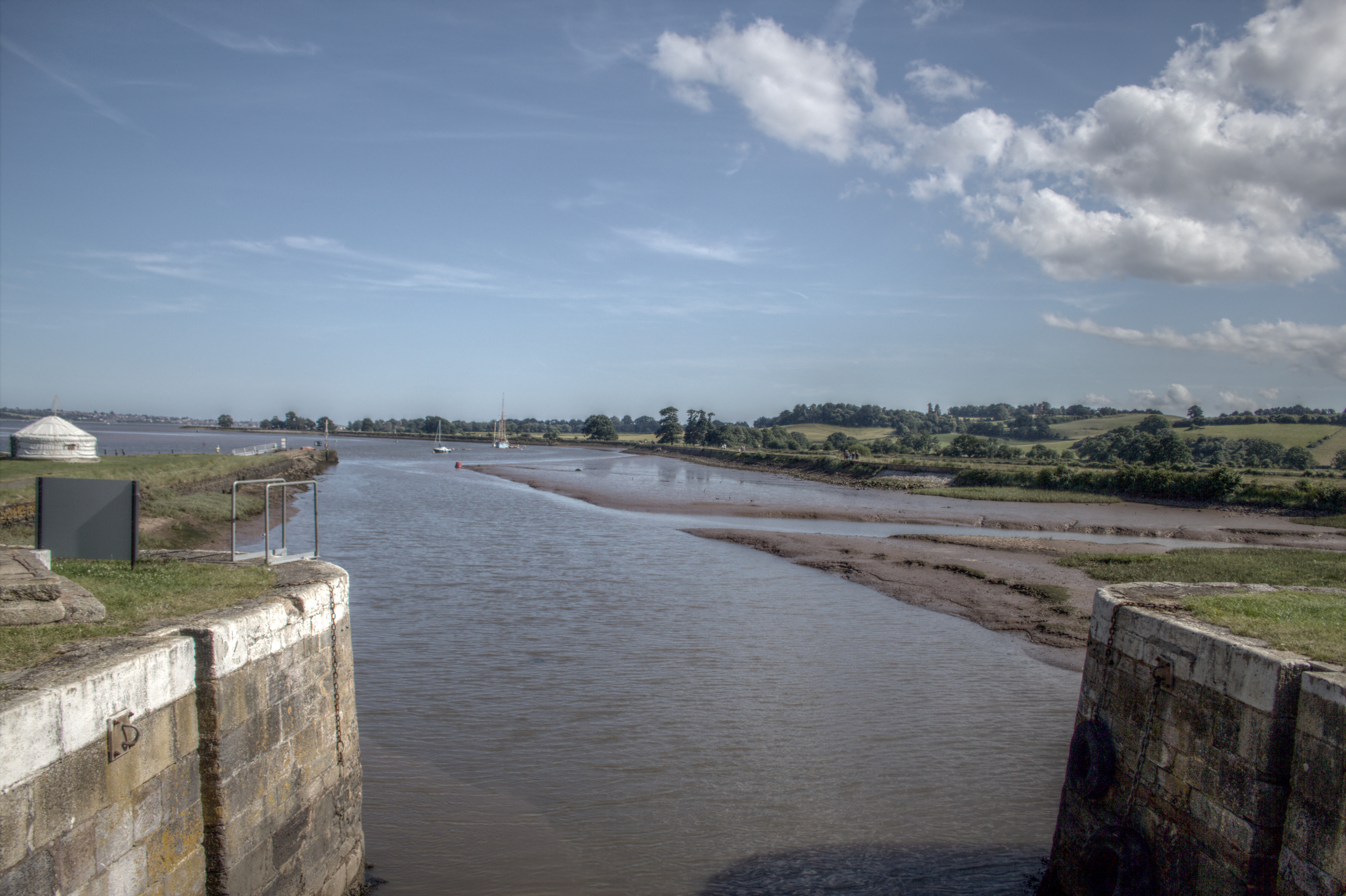
This is a normal HDR rendering to LDR that looks very much like what you would have seen with your eyes if you were there.
If you've been looking around, you'll notice there are a couple of other sliders near the saturation called 'Contrast Factor' and 'Detail Factor'.
As we turn the contrast factor down we get more local contrast in the image; taking it too low ends up causing a dark glow around things. Set it to 0.01 and update the preview. If you look at where the sky meets the horizon, you will see the dark glowing effect I mentioned.
Taking it too high makes everything very flat. Set it to 1.00 and update the preview again. You'll notice the brickwork on the left becomes very flat.
Set the contrast factor back to 0.10 and update the preview again.
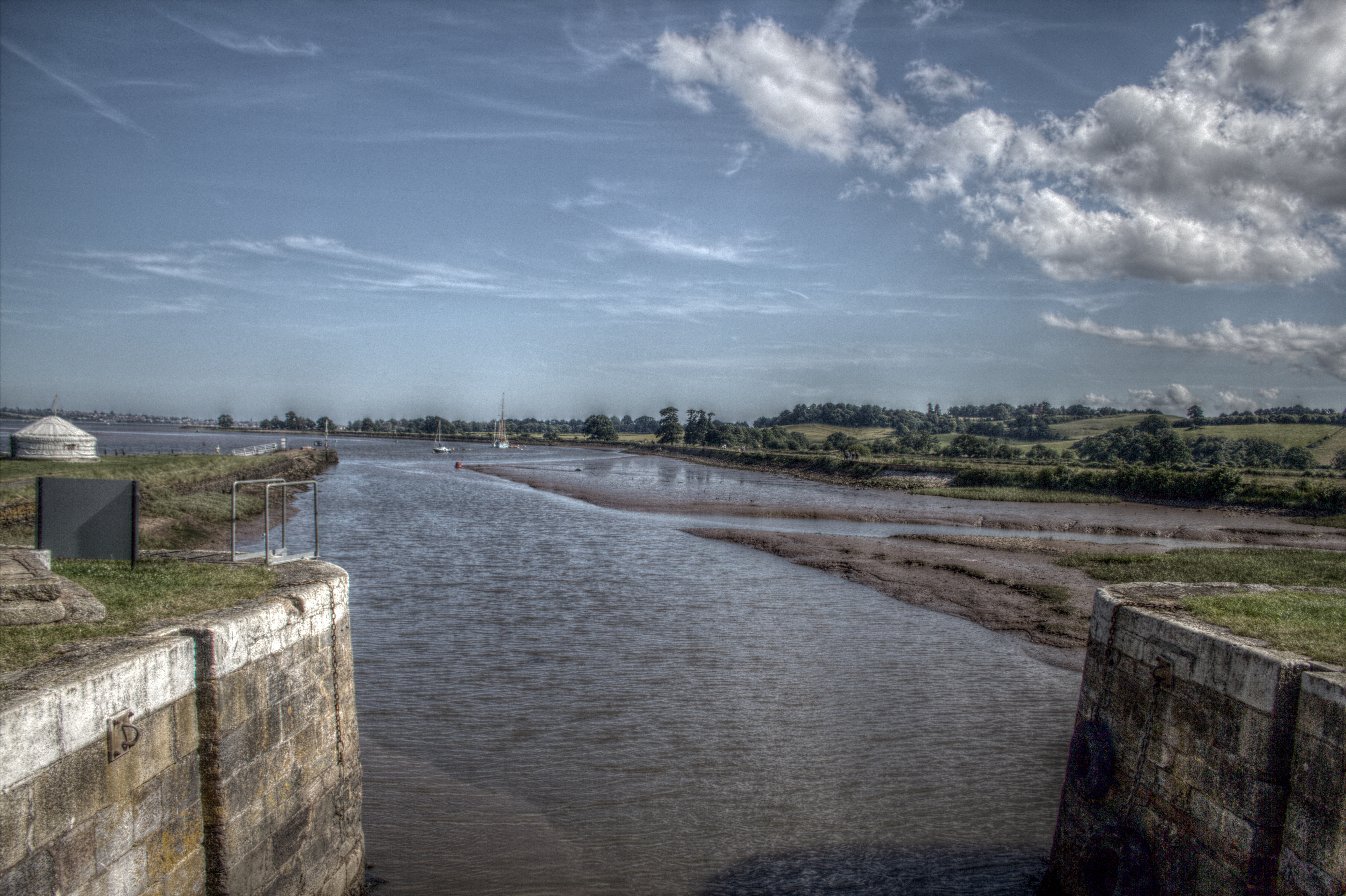
Detail factor is sort of the opposite. As we turn it up we get more detail in the highlights, more details in the shadows, and a resulting increase in contrast across the image.
Try setting it to 10 and update the preview again. You should now have something that you recognise as a classic ’HDR image‘. You should also notice that the black glow has returned to the horizon. But look at those clouds: they really stand out now and the brickwork on the left has also come right out and is almost glowing.

Keep pushing the detail factor up to an insane level, say 80, and update the preview.
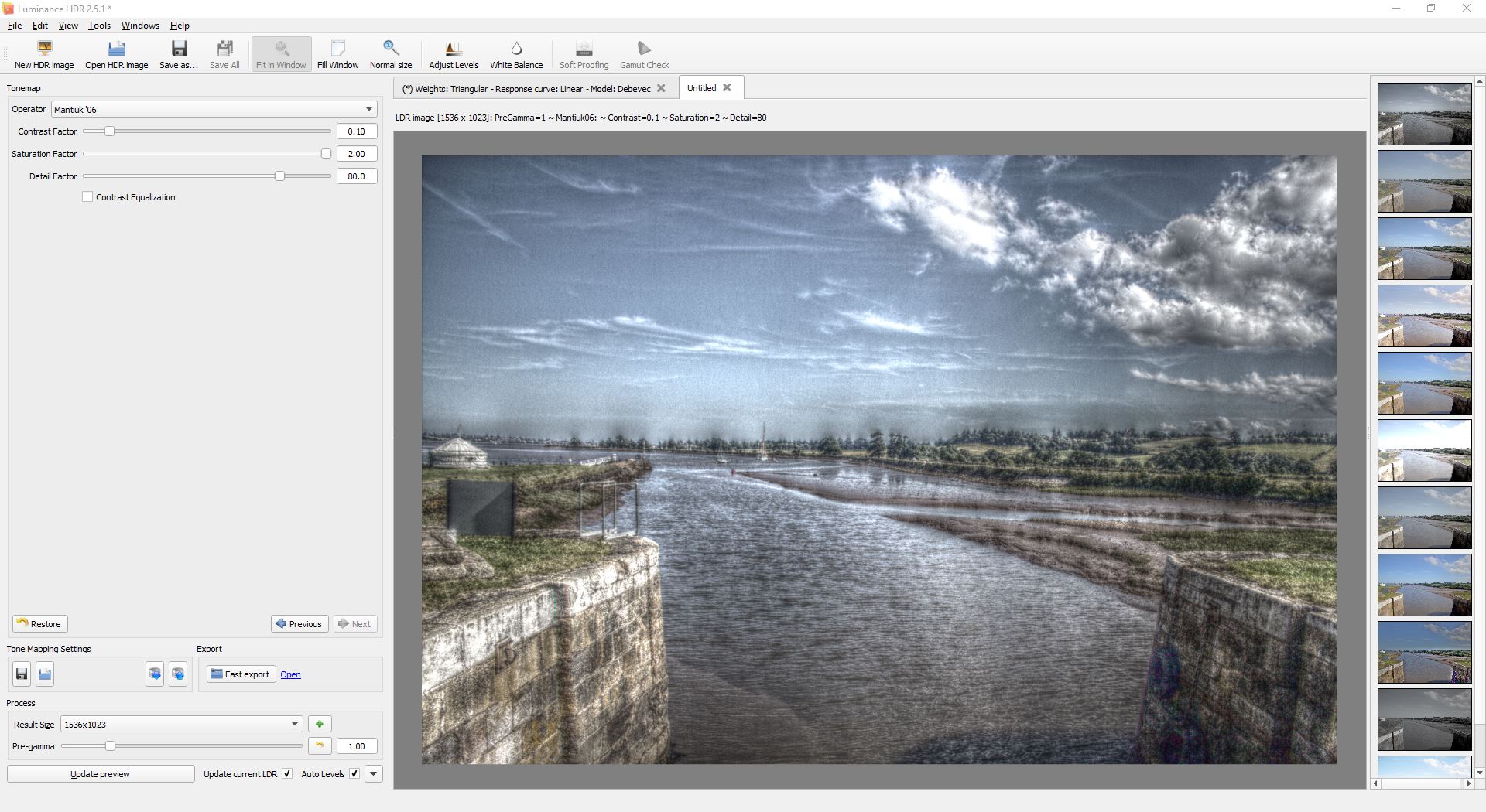
Now everything is glowing. If this was a night shot with lights in it, the lights would have glowing blooms around them. But you'll also notice the massive grain effect in the sky and the black glow on the darker areas. It looks almost like colour embossing.
You can up the contrast factor to compensate for this a bit. Increase it to 0.60 and update the preview again. You can see we've removed some of the glow but kept some of the detail, at a cost of losing some level of texture.
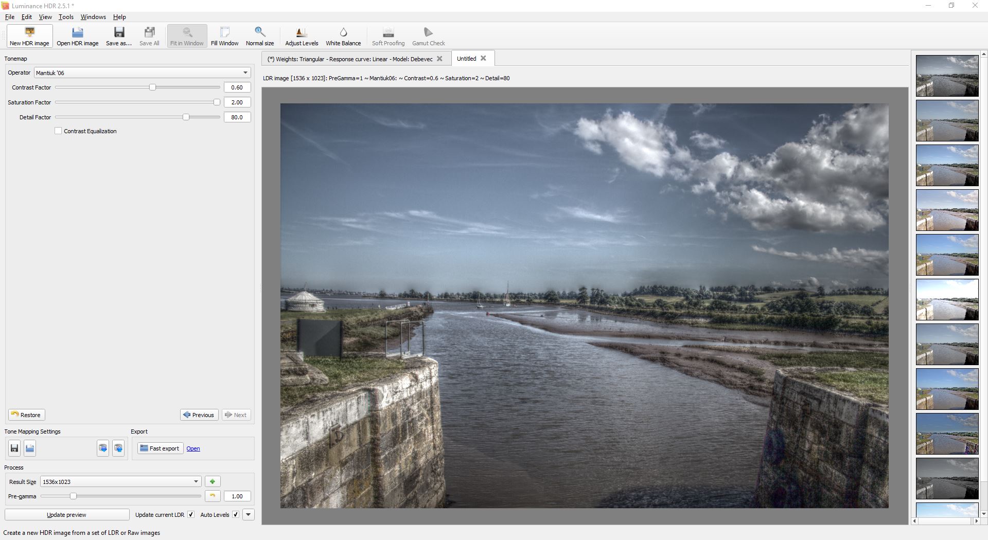
This is where the artistic and creative element comes in. You want to balance the contrast factor and the detail factor to get something you like. Each image will be different in how it responds so there aren't any set rules.
Let’s go for something that's pretty 'normal' for this type of image.
Contrast factor of 0.10
Saturation factor of 2.00
Detail factor of 10.0
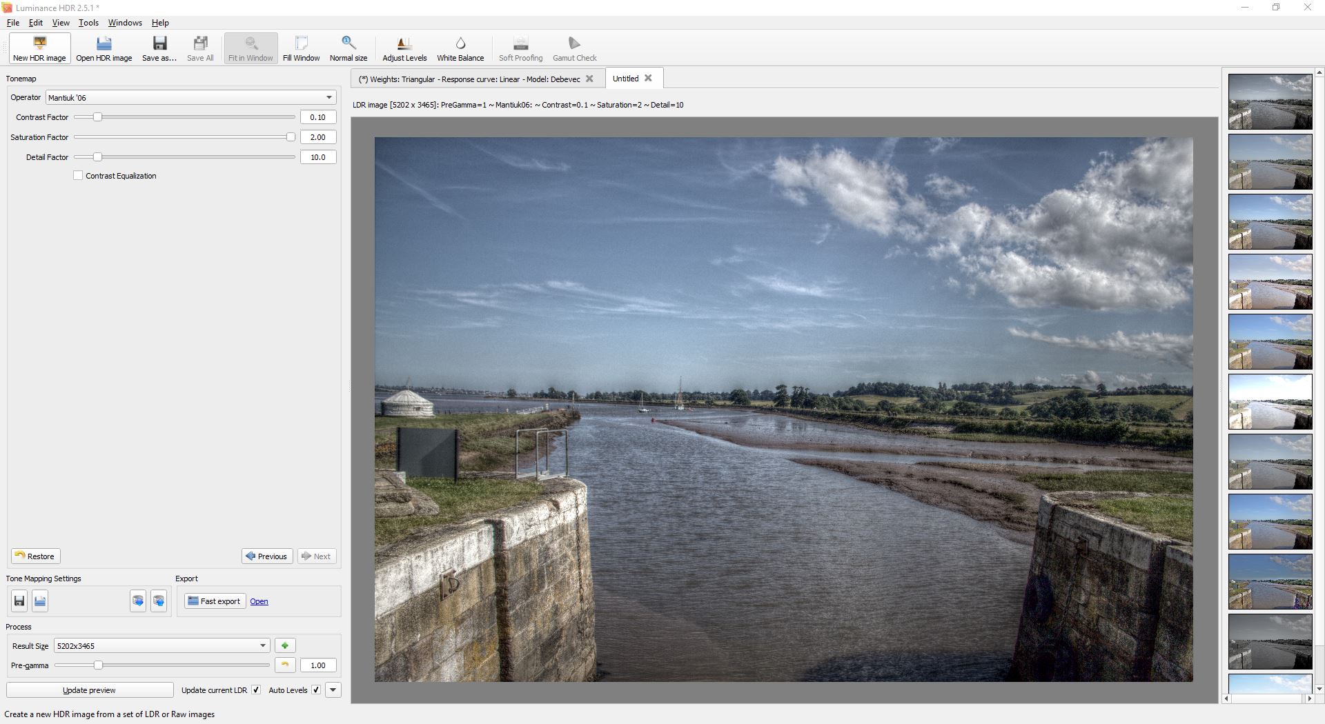
Now that we've got something we like the look of, we'll change the Result Size of the preview to the maximum value. For this example, that is 5202×3465. Click the [Update preview] button again.
This is going to take a while.
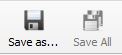
Once it's finished rendering the image at the high resolution, click the [Save As...] button to save the preview.
One nice thing is that it puts all the settings in the filename by default.
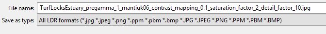
This is handy when you've got a previous image and you want to know what settings you used to create it.
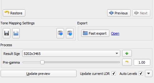
Now click the [Restore] button to set it back to the defaults and then bump the saturation back to 2.00. Click the [Update preview] button again.

Click the [Save As...] button.
It will name the file with the new settings and we can save the second image. (We’re going to use this in Gimp.)
Using G’MIC to tonemap an LDR.
(Or, what if I don't have an HDR image to start with?)
Download and install Gimp. You can find it here currently: https://www.gimp.org/downloads/
And also download and install the G'MIC plugin. Which you can find here currently: http://gmic.eu/download.shtml
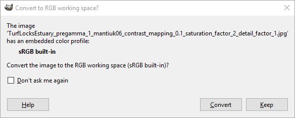
Load the second preview image we saved out into Gimp. The one with a detail factor of 1. Click the [Convert] button if it asks if you want to convert the colour space.
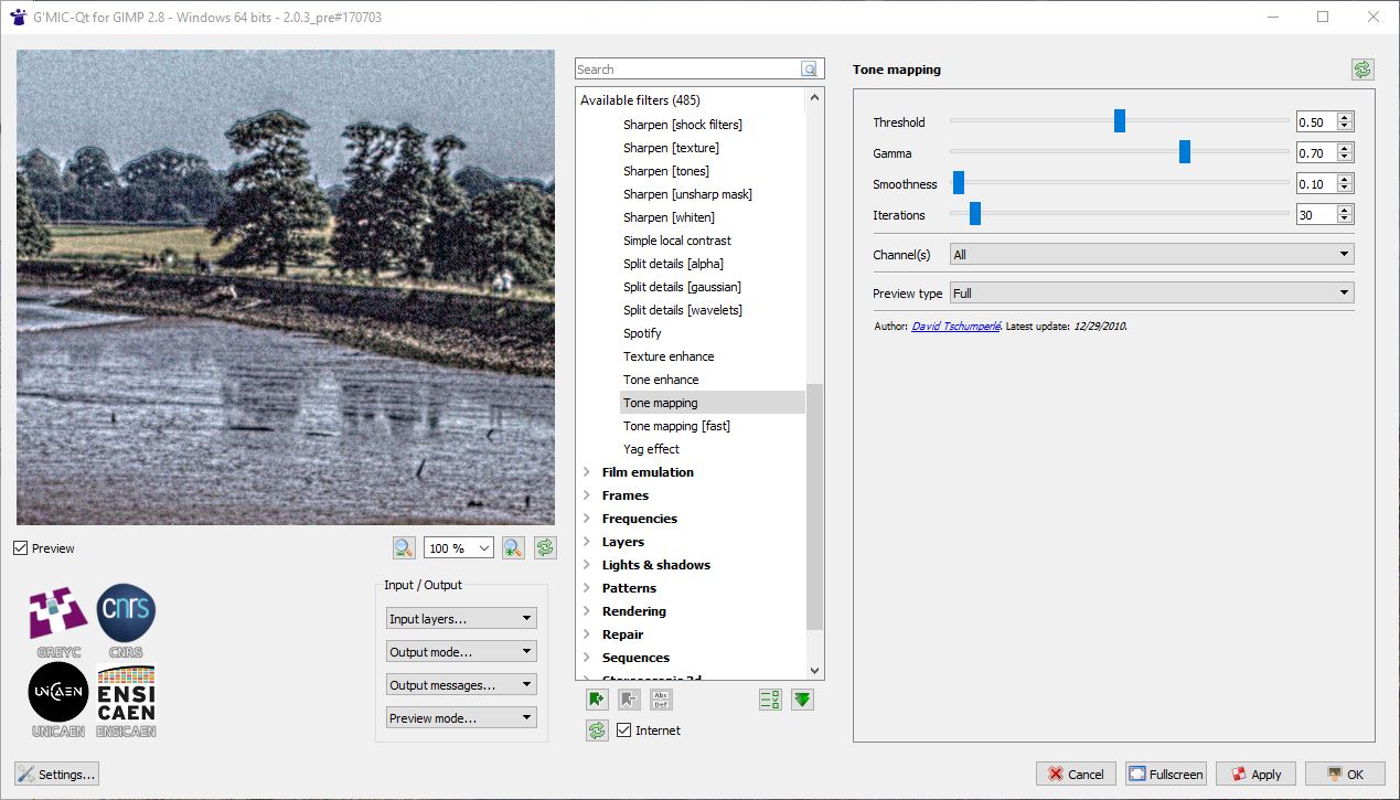
Now go to the Filters menu and choose G'MIC from the very bottom.
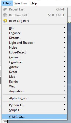
This opens a dialogue with a whole bunch of filters in.
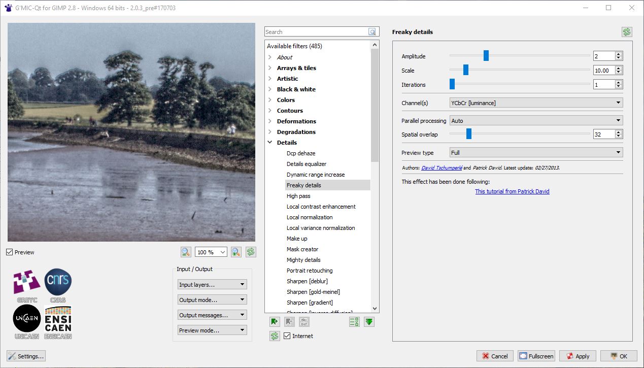
Scroll down the list of filter categories until you find [>Details] Open up the details section by clicking on the arrow.
Find the filter called 'Freaky Details' and select it. Don't worry about any of the settings, just click the [Okay] button to apply the filter.
Now go to the filters menu again and select G'MIC again. This time scroll down further in the [>Details] section and find 'Tone mapping'. Select it and click the [Okay] button.
This will take a long time.
Now go to the File menu and choose the [Export As...] option. Change the filename to have _edited.jpg at the end and click the [Export] button.
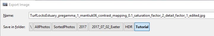
On the next dialog that opens set the quality setting for the jpg saving to 100% and again click the [Export] button.
Now compare the three images.
There's loads more you can do in G'MIC: apply noise reduction, add unsharp mask, or texture sharpening.
In Gimp itself you can adjust levels, add saturation, convert to black and white, and a whole bunch of other things.
We’ll just add some further saturation to our image.
Go to the Colors menu and select the Hue/Saturation option.
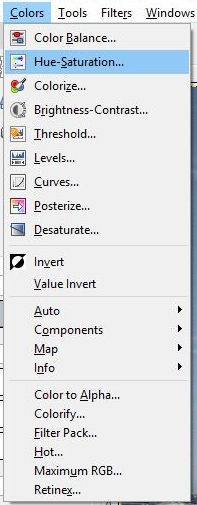
Bump the saturation up to 60 and click the OK button.
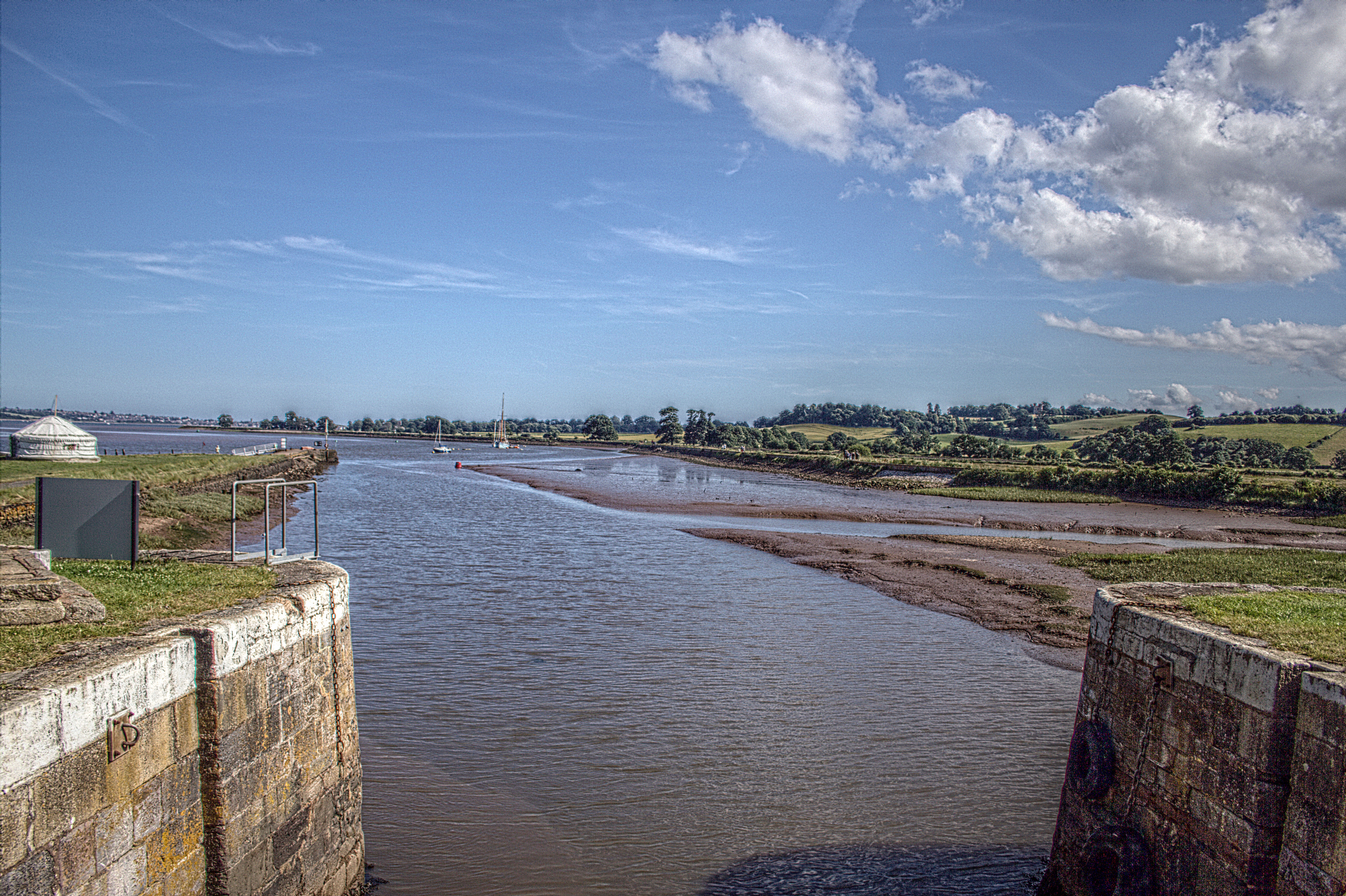
This gives us a nice level of saturation for publishing on the internet.
Go to the File menu and click Overwrite <filename.jpg> or choose to Export As again and give it a new filename if you want to keep the previous one.
Review your images again and decide which one you like most then publish on your favourite social media platform for many likes and shares.
I hope you found this post useful. You can contact me on Twitter @PeaEyeEnnKay or @HoldThatBox if you make an HDR and want to show me or if you spot a glaring mistake or typo.
Thanks to @PoulsonSally for your hard work proofreading and editing. Thanks to @Lizizziling for the inspiration.